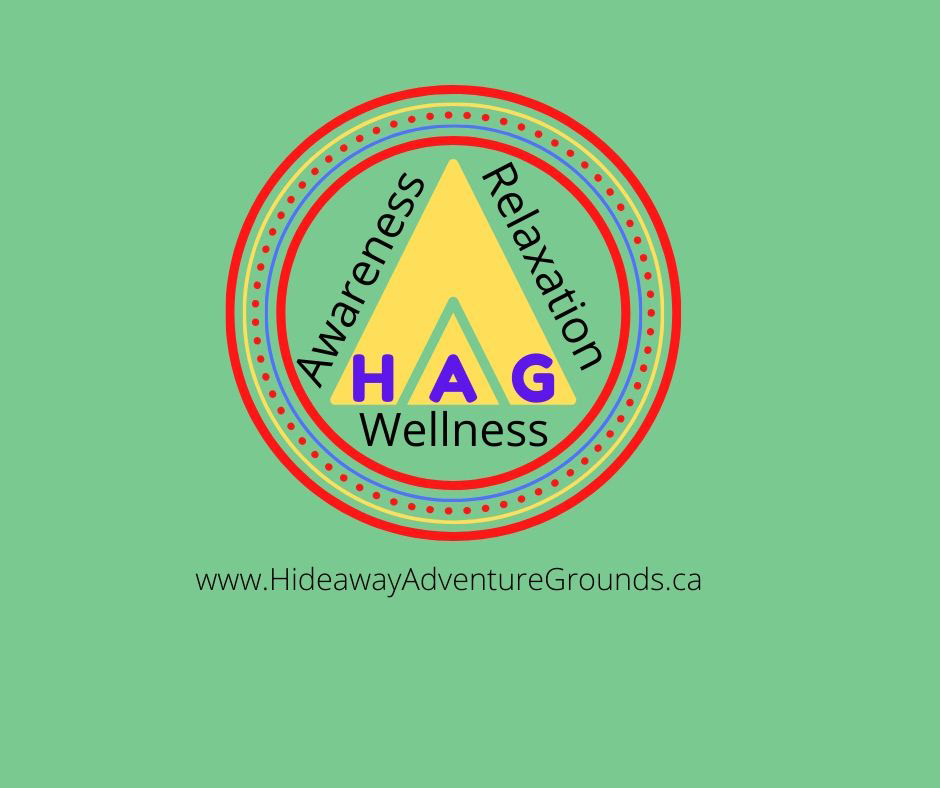
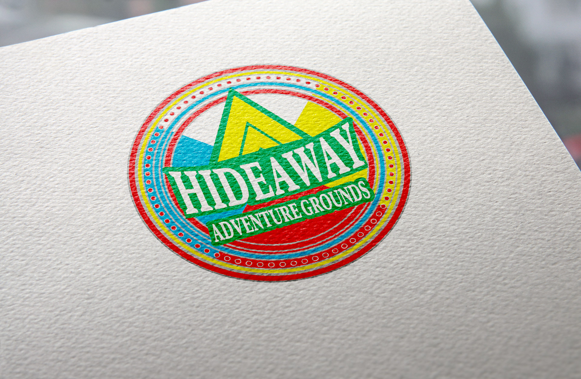
BEFORE
An Albertan based outdoor adventure company needed an update to their logo. The business is Indigenous which meant that the colours, shapes and elements previously used were all vital to the spirit of their logo. This is the logo that existed before I was asked to rework it. The client asked that the design be modernized while maintaining these important features. Using these elements, I was able to create something more modern, eye-catching, and versatile.
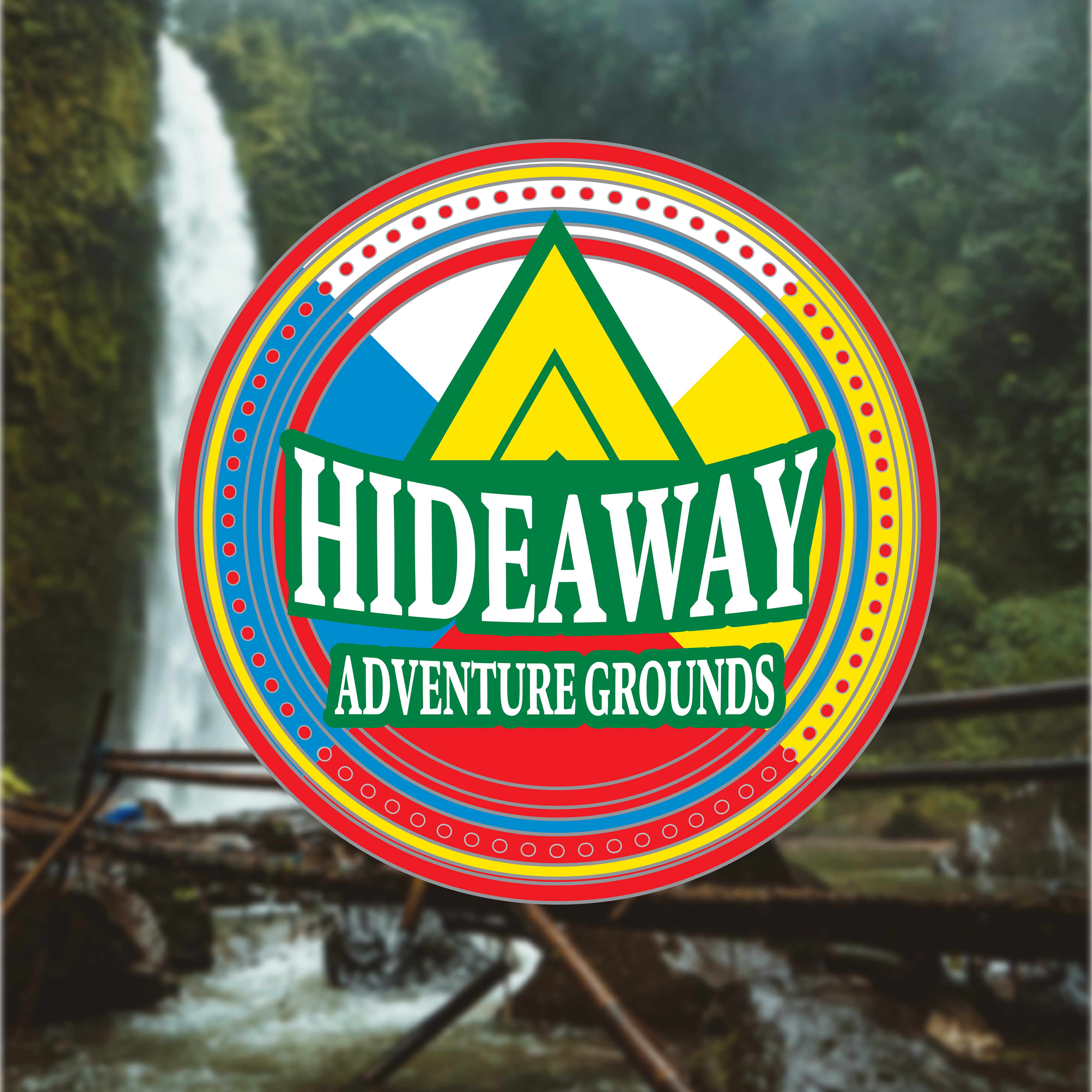
Logo
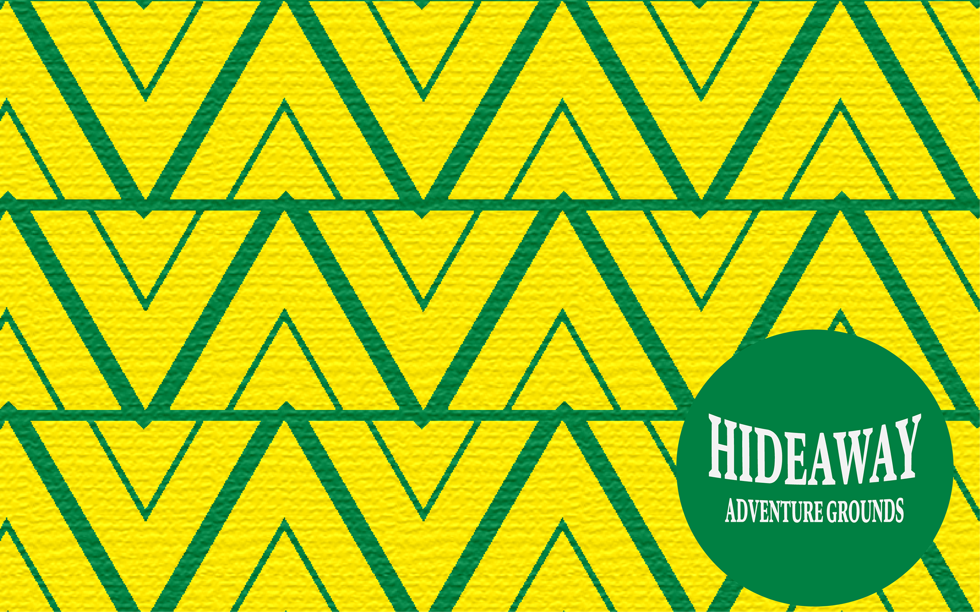
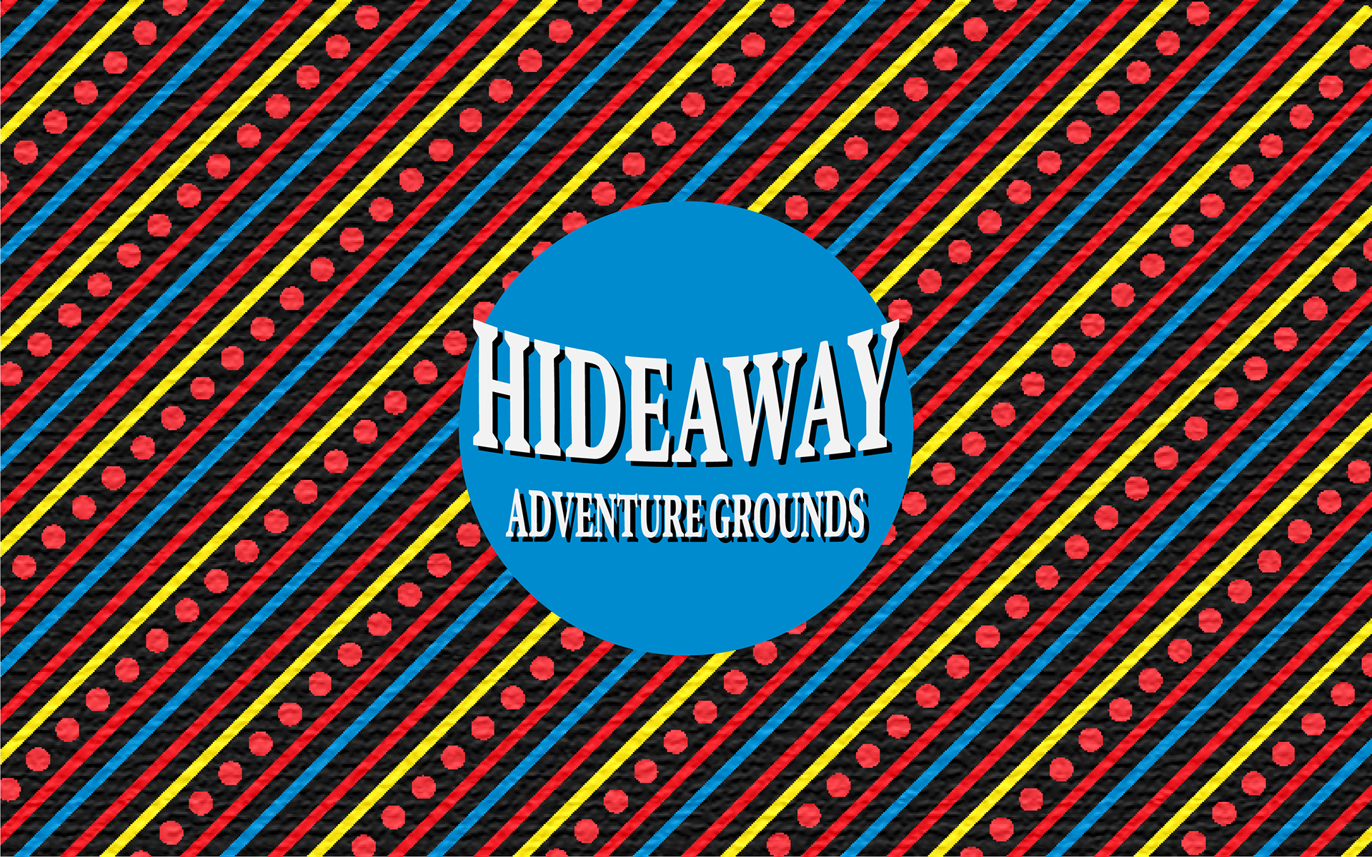
Logotype and pattern
Stationary
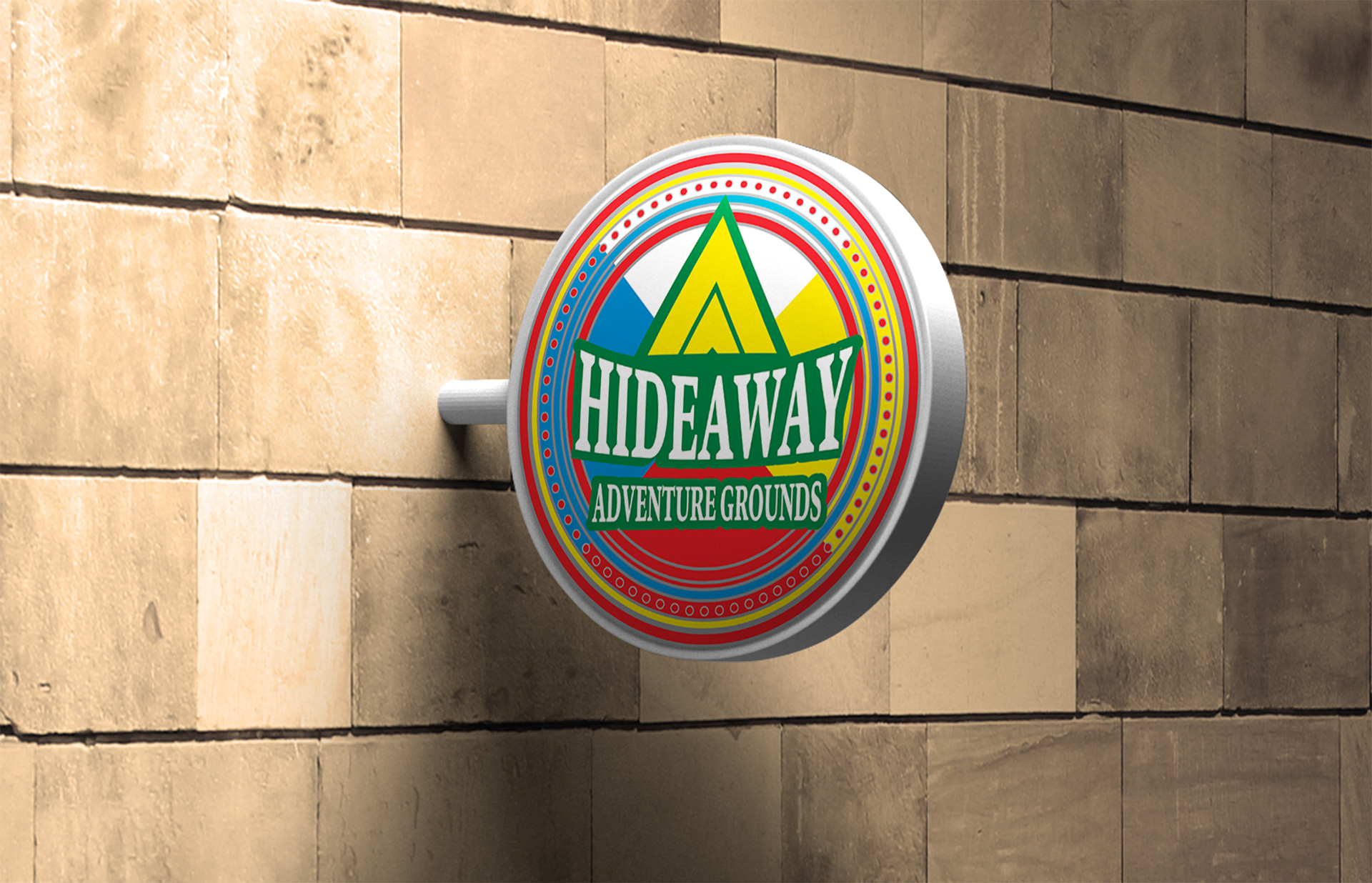
Signage